| Enhancing and Exporting Charts and Plots |
| Controlling HBAR
Statistics |
| Enhancing and Exporting Charts and Plots |
| Controlling HBAR
Statistics |
| In addition to adding titles, footnotes, formats, and labels to your SAS/GRAPH output, you can enhance specific types of graphs. In the lesson Creating Bar and Pie Charts, you saw that you can control which statistics are displayed to the right of a horizontal bar chart. You can also assign descriptive labels to the statistics in the HBAR statement (or HBAR3D statement, for three-dimensional charts) so your graphics will be easier to interpret. |
General form, HBAR and HBAR3D statements:
where
|
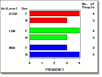
For example, the HBAR statement in the PROC GCHART step below specifies
that only the statistic FREQ (frequency) be displayed. It
also specifies that the FREQ label be replaced with the more descriptive
wording No. of People. Notice that the label is automatically
wrapped to conserve space.
        proc gchart data=clinic.admit;
           hbar sex / group=actlevel
                patternid=group freq
                freqlabel='No. of People';
        run;
|

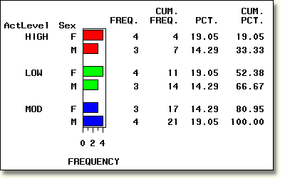
In contrast, the example below shows the default statistics and labels
for a horizontal bar chart.
        proc gchart data=clinic.admit;
           hbar sex / group=actlevel
                patternid=group;
        run;
|

  |
|
Copyright © 2002 SAS Institute Inc., Cary, NC, USA. All rights reserved.