| Creating Plots | |
| Scaling Axes |
| To scale the axes in your plot, you can specify the VAXIS= and HAXIS= options in the PLOT statement. The VAXIS= option specifies tick marks along the vertical axis, and the HAXIS= option specifies tick marks along the horizontal axis. Notice that a slash (/) precedes options in the PLOT statement. |
General form, PLOT statement with VAXIS= and HAXIS=
options:
where value-list or range determines the placement of tick marks along the axis.
|
| Specifying Values
As you saw above, you can scale axes using
|
| Let's see how each of these methods works.
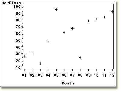
Notice the default scaling for the axes in the plot below. All months of the year are represented. |

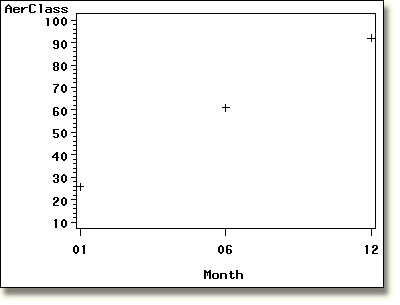
But suppose you want to plot only January, June, and December. By specifying
the HAXIS= option, shown below, you can scale the horizontal
axis using only the values listed. Note that Month is a
character variable, even though its values
are digits. You must enclose character values in quotes
and specify them exactly as they appear in the data set. |
proc gplot data=clinic.therapy1999; |

| Notice the modified horizontal axis. Also, points are plotted only for the months that HAXIS= specifies. |
  |
|
Copyright © 2002 SAS Institute Inc.,
Cary, NC, USA. All rights reserved.