| Creating Bar and Pie Charts |
| Additional
Features |
| Creating Bar and Pie Charts |
| Additional
Features |
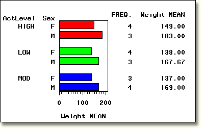
| You can specify a number of other statements and options to enhance your charts. For example, you can use the GROUP= option to categorize data. |
        proc gchart data=clinic.admit;
           hbar sex / sumvar=weight type=mean
                group=actlevel patternid=group;
        run;
|
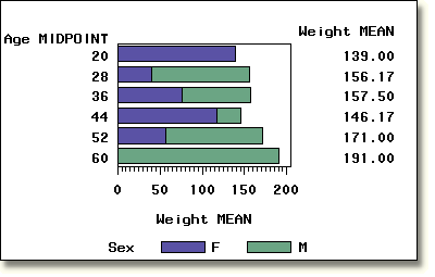
| You can use the SUBGROUP= option to subdivide bars by category. You can also control how colors and patterns are assigned using the PATTERNID=SUBGROUP option and multiple PATTERN statements. In the PATTERN statements below, the value lib specifies the color light blue and the value lig specifies the color light green. |
        pattern1 color=lib;
        pattern2 color=lig;
        proc gchart data=clinic.admit;
           hbar age / sumvar=weight type=mean
                subgroup=sex patternid=subgroup mean;
        run;
|
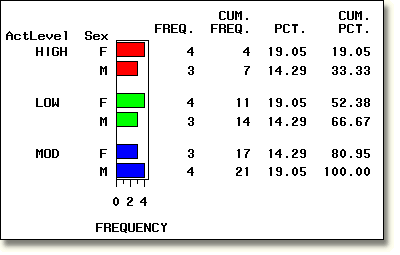
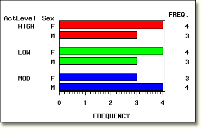
| For horizontal bar charts, you can control which statistics are displayed to the right of the chart. The first chart below shows the default statistics for a horizontal bar chart. The second chart shows a GCHART statement which requests only the statistic FREQ. |
        proc gchart data=clinic.admit;
           hbar sex / group=actlevel
                patternid=group;
        run;
|
        proc gchart data=clinic.admit;
           hbar sex / group=actlevel
                patternid=group freq;
        run;
|
  |
|
Copyright © 2002 SAS Institute Inc.,
Cary, NC, USA. All rights reserved.