| Creating Bar and Pie Charts |
| Additional
Features |
| Creating Bar and Pie Charts |
| Additional
Features |
| For pie charts, you can specify text color by using
the CTEXT= option, control where labels appear by using
the SLICE= option, and explode one or more pie slices for
effect by using the EXPLODE= option.
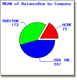
The pie chart below shows the relationship of the average balance due amounts for each of three companies, RURITAN, ACME and USA INC. The chart emphasizes the company ACME by exploding its section of the pie. |
     proc gchart data=clinic.insure;
        pie company / sumvar=balancedue type=mean
            ctext=blue slice=arrow explode="ACME";
        where Company in ("ACME", "RURITAN", "USA INC.");
     run;
|
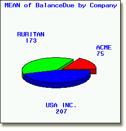
| You can easily create three dimensional charts using the PIE3D, VBAR3D, and HBAR3D statements. |
proc gchart data=clinic.insure;
pie3d company / sumvar=balancedue type=mean
ctext=blue explode="ACME";
|
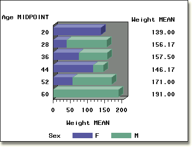
     pattern1 color=lib;
     pattern2 color=lig;
     proc gchart data=clinic.admit;
        hbar3d age / sumvar=weight type=mean
               subgroup=sex patternid=subgroup mean;
     run;
|
| There is a variety of other ways to enhance your bars and charts. To learn more about them, complete the lesson Enhancing Charts and Plots. |
  |
|
Copyright © 2002 SAS Institute Inc.,
Cary, NC, USA. All rights reserved.