| Creating Plots | |
| Additional Features |
| There are a variety of other ways to enhance your plots.
For example, you are not limited to a single plot for each pair of
variables. In a plot of the form y*x=z, you can generate multiple
plots based on the value of a third variable, called a classification
variable. A legend is automatically generated based on the values
of the classification variable. To control the appearance of the legend,
you can use a LEGEND statement.
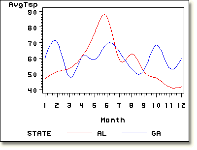
The output on the chart below displays a plot of symbol1 color=red interpol=spline value=none;
symbol2 color=blue interpol=spline value=none;
proc gplot data=air.airqual;
plot avgtsp*month=state;
where state in ("AL" , "GA");
run;
|
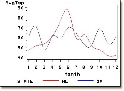
You can also control the minor tick marks for the vertical and horizontal
axes by using the HMINOR= and VMINOR=
options. symbol1 color=red interpol=spline value=none;
symbol2 color=blue interpol=spline value=none;
proc gplot data=air.airqual;
plot avgtsp*month=state / vminor=3 hminor=0;
where state in ("AL" , "GA");
run;
|
  |
|
Copyright © 2002 SAS Institute Inc.,
Cary, NC, USA. All rights reserved.